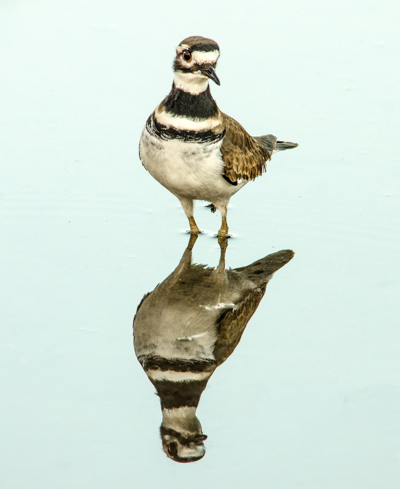
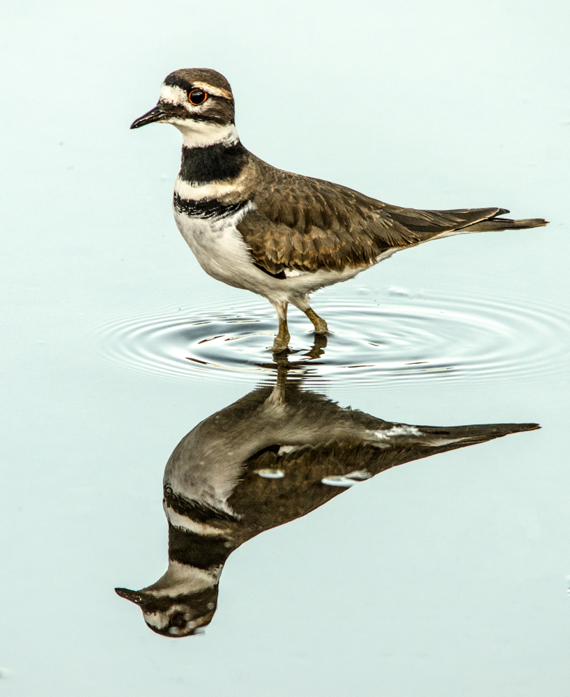
Posted on October 23, 2018 by Tuxedo Sophisticated CatKilldeer: Color vs. Black and White I’ve processed a couple of my killdeer photos in color and black and white. Which do you prefer? Maralee Rate this:Share this: Share on X (Opens in new window) X Share on Facebook (Opens in new window) Facebook Email a link to a friend (Opens in new window) Email Share on LinkedIn (Opens in new window) LinkedIn Like Loading... Related
Personally, I think the drab plumage is better suited for B&W; more dramatic and striking. Some might not agree. Reply
The image you use as the cover pic works well in B&W.. that ripple makes the contrast on the water. Not too sure about the second image, I think without that ripple the colour works best. Just my view in the debate. 🙂 Reply
They have merits both ways, I’m hard pressed to choose. The B&W could make a very dramatic print. Reply
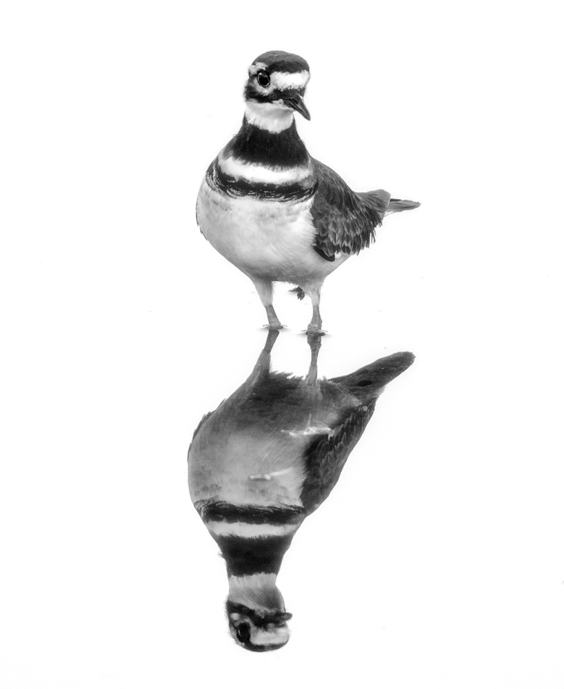


Personally, I think the drab plumage is better suited for B&W; more dramatic and striking.
Some might not agree.
The image you use as the cover pic works well in B&W.. that ripple makes the contrast on the water. Not too sure about the second image, I think without that ripple the colour works best. Just my view in the debate. 🙂
so beautiful, fascinated me. Thank you, Love, nia
They have merits both ways, I’m hard pressed to choose. The B&W could make a very dramatic print.
I like both, but prefer probably the color.